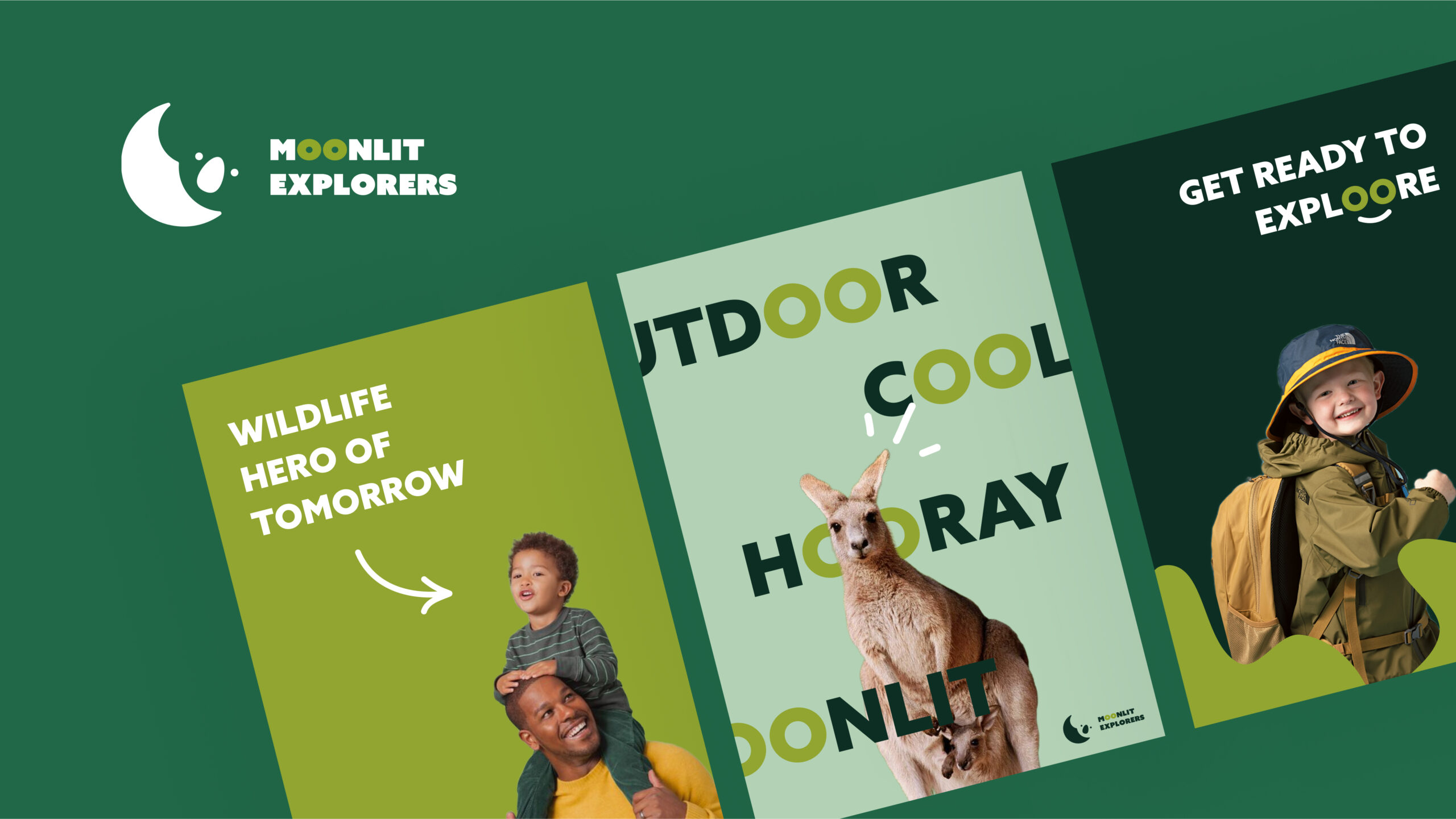
Moonlit Explorers.
Redesigning an Australian Animal Sanctuary
SOLO UNIVERSITY PROJECT
SERVICES
Logo Design
Branding
Strategy
Research
CHALLENGE
Experience Australia's nocturnal animals under the moonlit sky.
Inspiring the Next Generation.
This rebranding initiative was designed to refocus the sanctuary on education and attract a younger audience. The main goal was to emphasize the sanctuary's dedication to preserving Australia's wildlife, especially endangered species, and to establish it as a leader in youth environmental education through engaging activities.

SOLUTION
A Sanctuary for Young Adventurers.
To make the sanctuary more appealing to children and highlight its unique night-time animal interactions, logo concepts emphasizing the bond between children and animals were created. Choosing the iconic Koala as their mascot adds personality and reinforces their identity as a place of discovery and connection with nature.
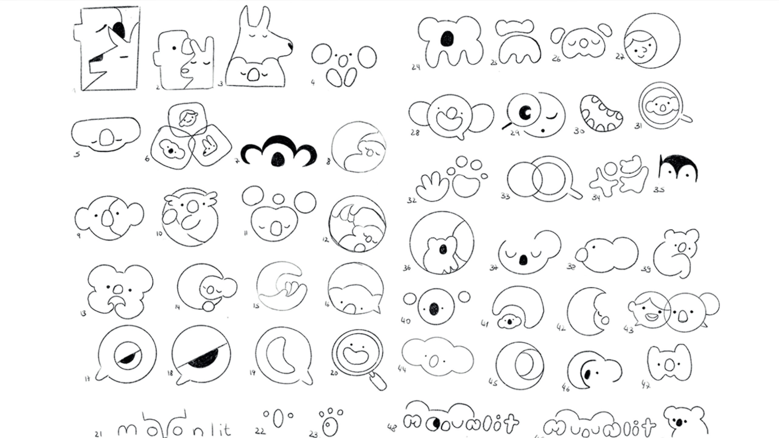
Logo explorations for Moonlit Sanctuary

Colors and Toolbox
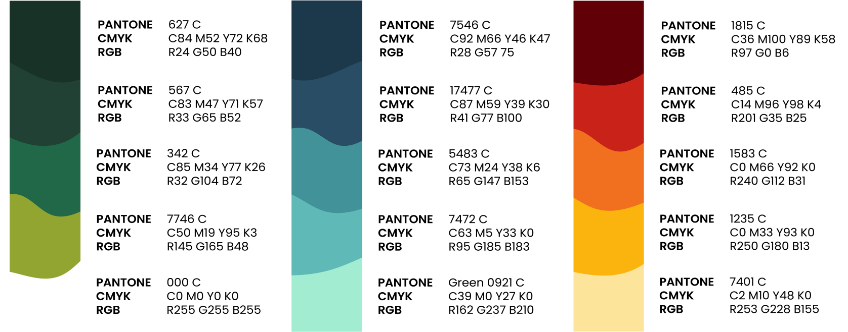
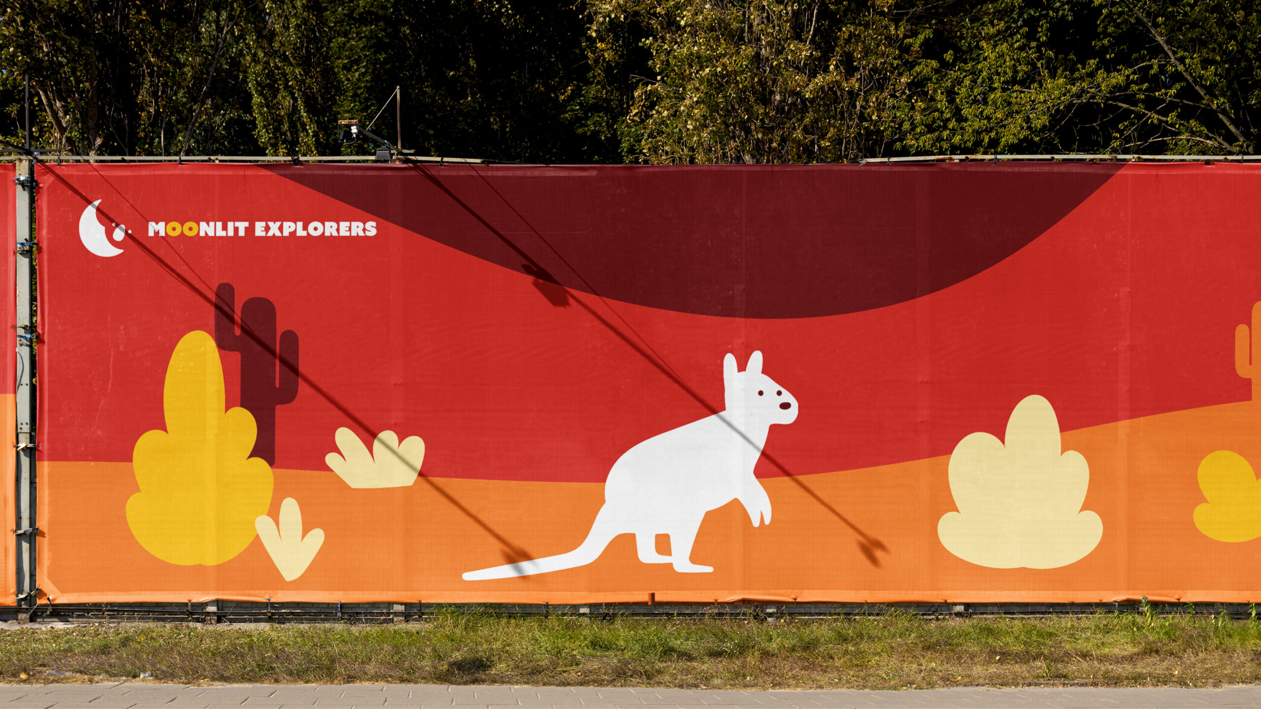
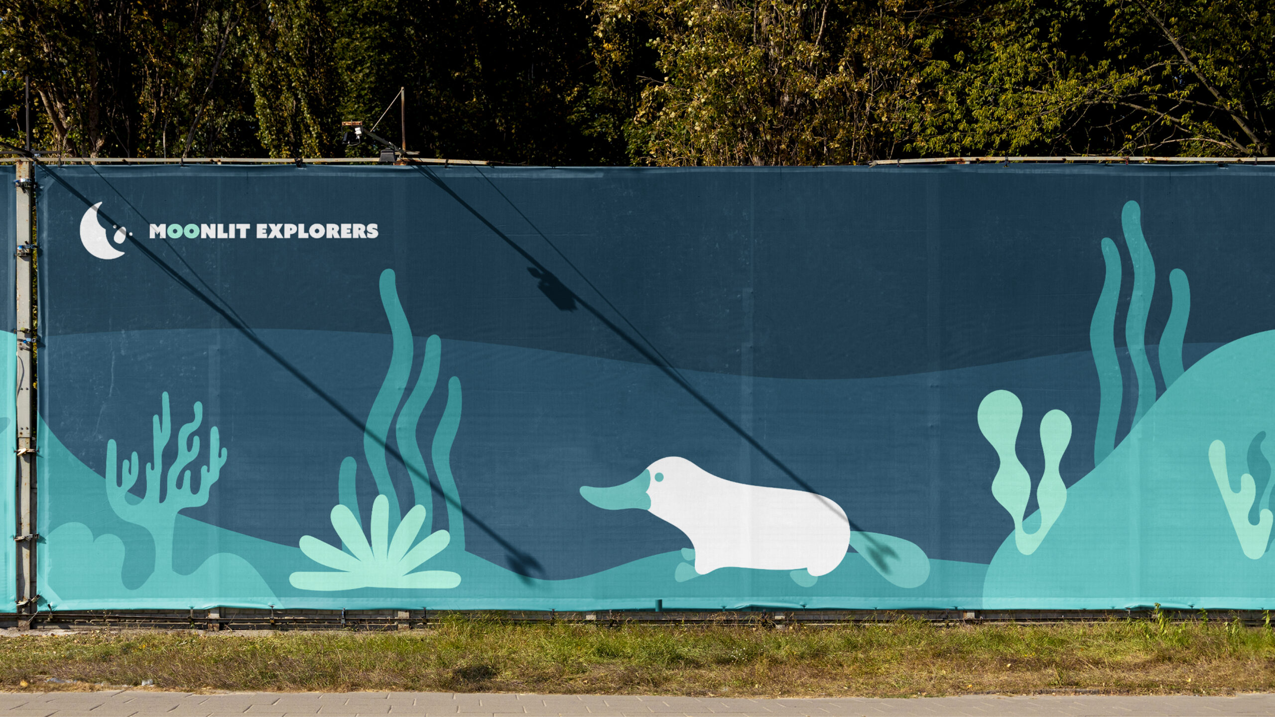
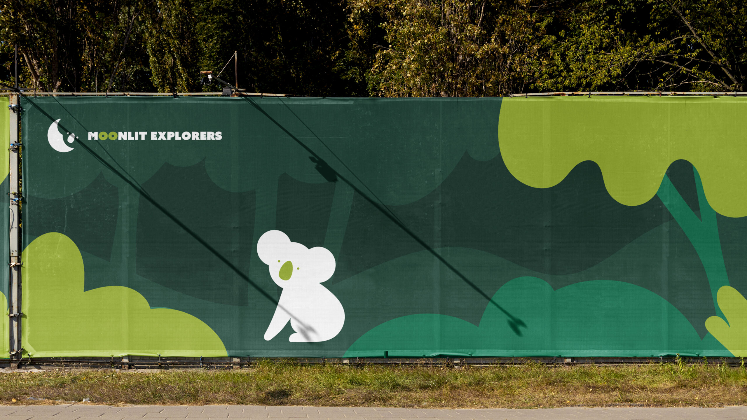
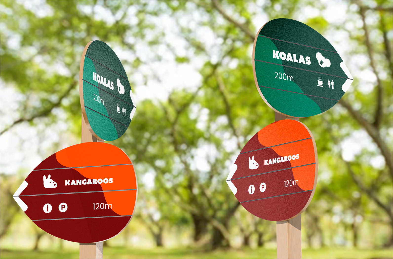
Moonlit Explorers' brand colors reflect Australia's unique landscapes – from lush eucalyptus forests to azure oceans and expansive outback. Their brand applications feature simple flat graphics, each mirroring a specific habitat with layered shapes and gradients for depth and vibrancy.
Branding Applications
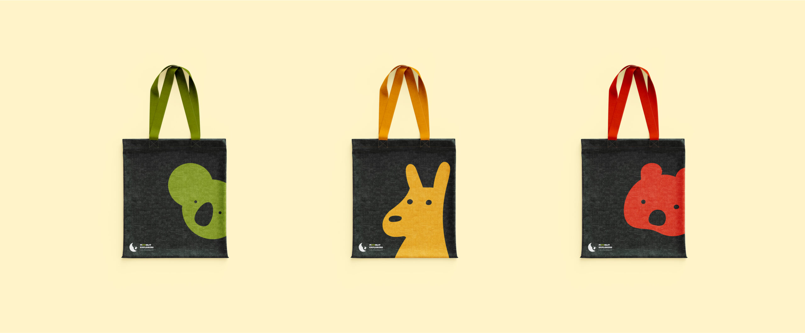
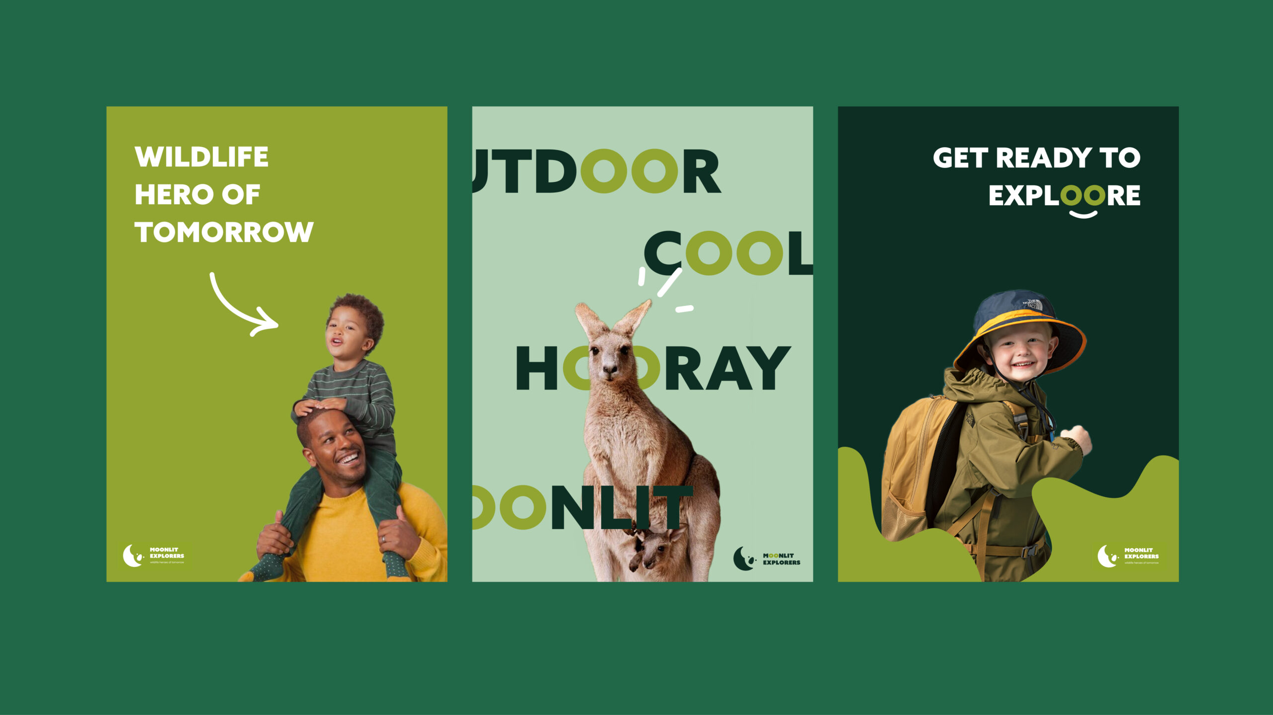
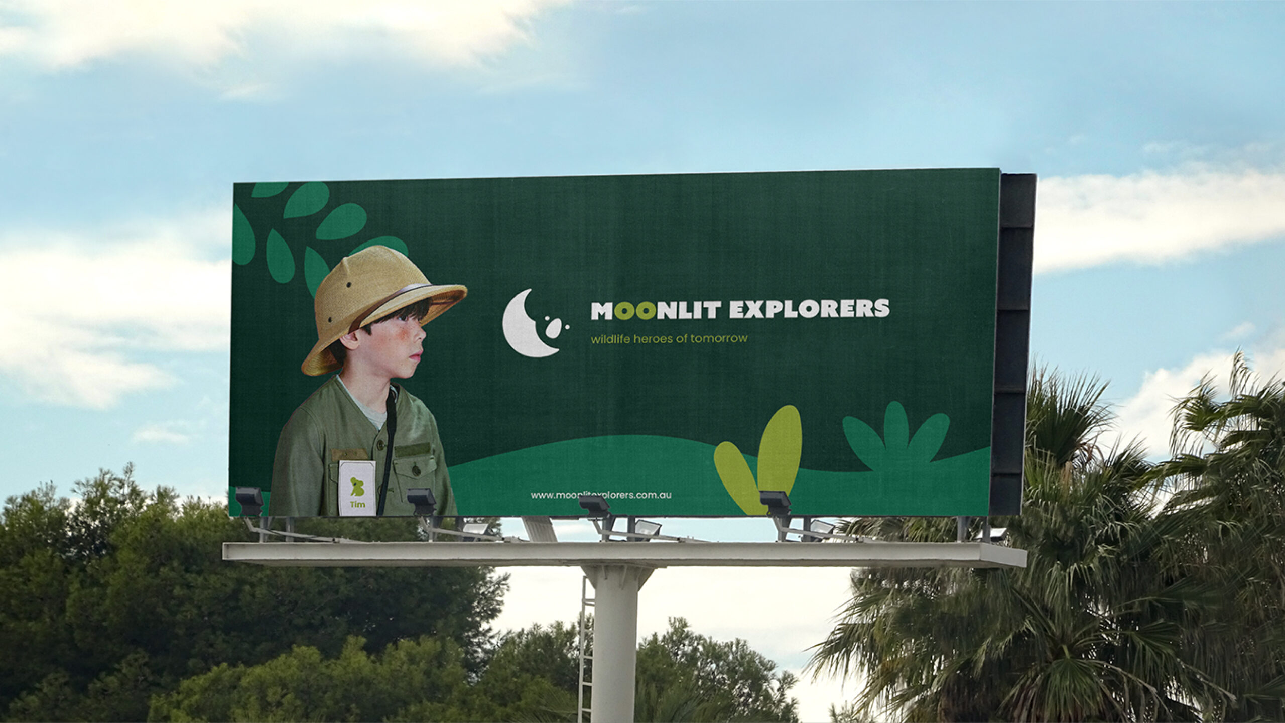
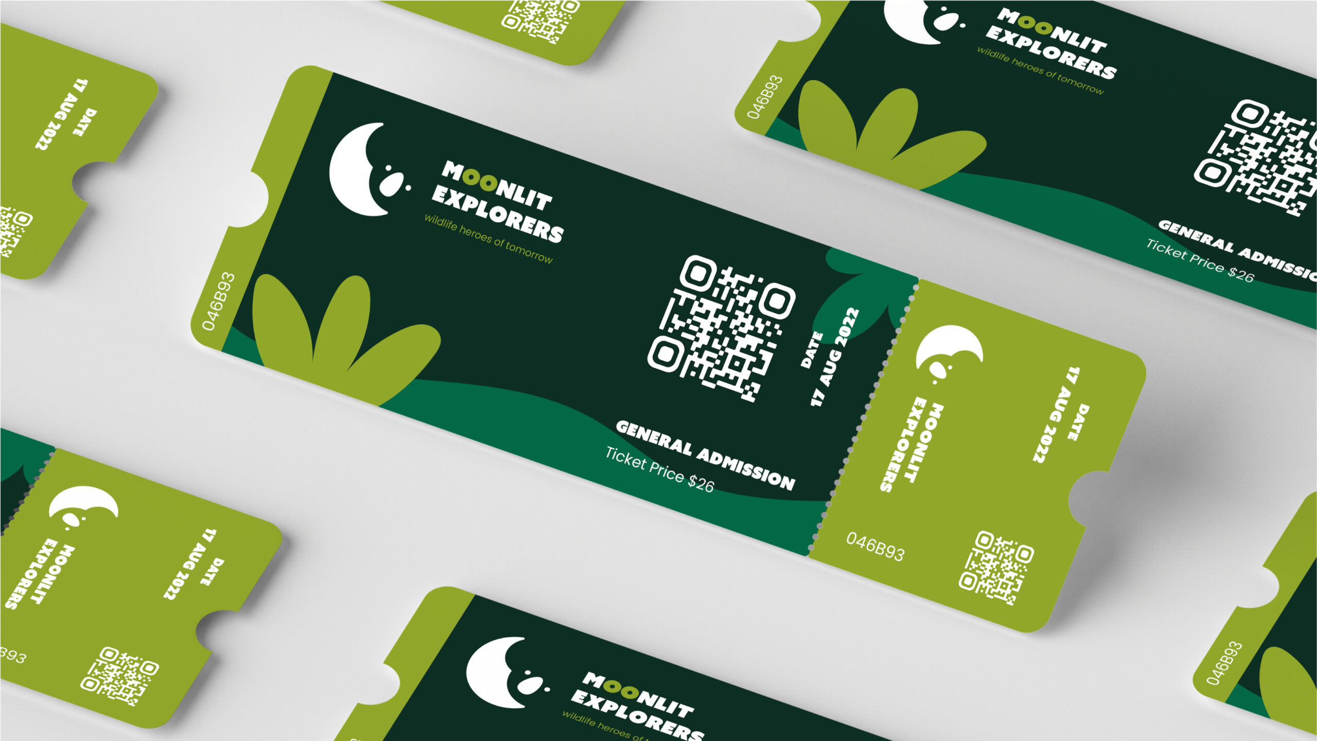
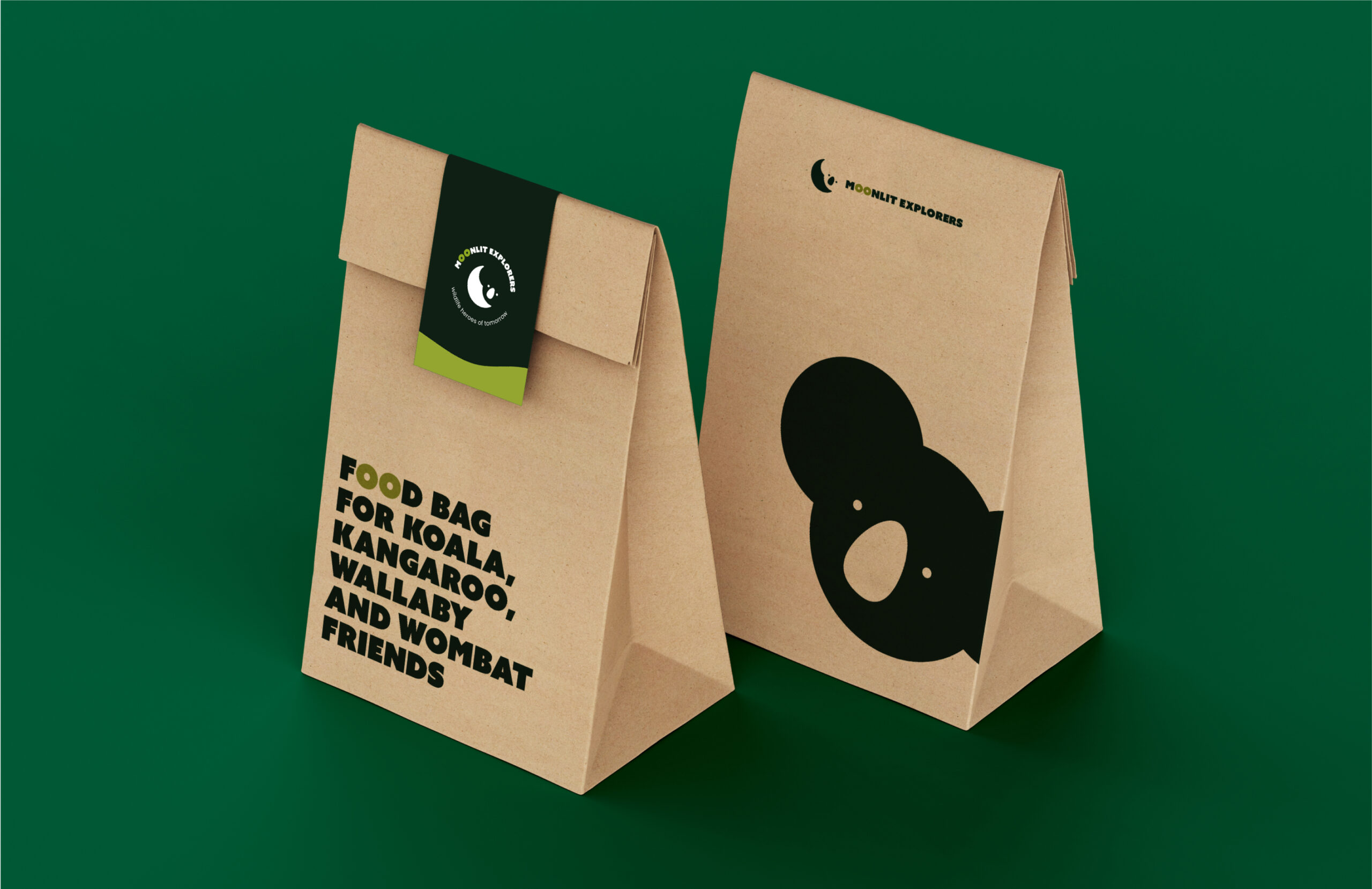
The branding applications are designed to ignite a strong brand presence at every turn with habitat-inspired colors and playful animal illustrations, so that even the youngest visitors, who may not read yet, can navigate the park with ease and excitement.
LEARNINGS
Designing Every Detail with Purpose.
Through this branding project, I gained valuable insights into the intricacies of brand development and the importance of aligning visual identity with the brand’s core values. It has reinforced the significance of meticulous research, creative design, and effective communication in shaping a brand's success, and made clear that every decision, from color choices to font selection, should be driven by genuine intent and purpose, rather than mere aesthetics.
